In the highly saturated global wine market, packaging design has officially transcended mere aesthetic vanity. Approaching 2026, creating a successful brand requires mastering a multidimensional engineering puzzle. The modern buyer’s journey is ruthless: a bottle must simultaneously seize attention from three meters away on a crowded shelf, survive the brutal physics of cross-border e-commerce transit without a single scuff, comply with draconian international legal mandates, and execute all of this without decimating the winery’s profit margins. This guide strips away the superficial layers of artistic theory to reveal the hard commercial realities, structural physics, and psychological typography strategies that truly drive return on investment (ROI) in modern wine packaging design.
Visual Identity: Labels, Typography, and Brand Storytelling
A fatal mistake made by inexperienced designers is treating the wine label as a standalone canvas. In reality, visual identity must be engineered to serve brand strategy and shelf conversion rates. Every choice regarding paper texture, color saturation, and font weight acts as a psychological trigger, quietly communicating the price point and heritage of the liquid inside before the cork is ever pulled.
Label Design & Typography: Comprehensive Paper and Color Psychology
To establish a formidable market presence, brands must align their typography and material selections with specific consumer archetypes. We can categorize this psychological mapping into four dominant stylistic paradigms:
- The Classic / Vintage Authority: Designed to command respect and justify ultra-premium price tags. This style relies on high-grammage uncoated textured papers, intricate foil stamping in deep red or antique gold, and heavy serif typography. It signals heritage and unwavering quality to the traditional connoisseur.
- The Minimalist / Modern Elite: Targeting the modern urban professional. It utilizes pure white, smooth-finish stocks paired with stark, high-contrast monochrome palettes and ultra-clean sans-serif fonts. The abundant use of “negative space” subconsciously implies a confidence that does not need to shout to be noticed.
- The Avant-Garde / Rebellious: Engineered specifically for Gen Z and millennial disruptors. This approach weaponizes high-saturation fluorescent colors, irregular die-cut label shapes, and anti-conventional, chaotic typography. It is designed to shatter the traditional wine etiquette and stand out in noisy retail environments.
- The Organic / Natural Expression: The visual language of terroir. Utilizing eco-friendly grass papers or recycled stocks with visible fibers, combined with low-saturation earth tones and watercolor illustrations. It immediately signals low-intervention winemaking and environmental stewardship.
However, aesthetic ambition must meet mechanical reality. For instance, while high-grammage uncoated textured paper feels incredibly luxurious to the touch, it is notoriously problematic on high-speed automated labeling lines. The texture minimizes the surface contact area for the adhesive, significantly increasing the risk of the label peeling off in damp cellar conditions if a specialized wet-strength adhesive is not meticulously specified.
Inspirational Case Studies: Translating Brand Story into Visuals
Consider the stark contrast in “Shelf Block Effect”—the ability of a packaging design to register in a consumer’s brain within two seconds from a distance of three meters. In blind visual tests across major retail channels, highly detailed, text-heavy traditional Bordeaux labels often merge into a unified “sea of white and gold” on the shelf. While beautiful up close, they lack a singular disruptive element.
Conversely, modern New World brands have achieved astronomical retail success by deploying Super Symbols. By replacing paragraphs of tasting notes with a single, massive, foil-stamped icon or an aggressively oversized typography lockup, these brands create an immediate visual anchor. This strategy proves that in crowded supermarket environments, simplifying the visual hierarchy and amplifying a single brand motif drastically outperforms intricate, nuanced storytelling.

Packaging Materials and Structural Protection
The most breathtaking label design is financially worthless if the bottle shatters during transit, or if the consumer opens their highly anticipated delivery only to find the luxury label severely scuffed by cheap friction. As Direct-to-Consumer (D2C) channels dominate, packaging must evolve from mere decoration to high-performance physical armor.
The D2C Unboxing Experience: A Comprehensive Matrix of Cushioning Materials
When engineering the secondary packaging, procurement teams must balance impact resistance against the visceral “unboxing ceremony” and environmental optics. The wrong insert material will silently destroy your brand equity. Below is a critical evaluation of industry-standard cushioning materials:
| Material Type | Impact Protection | Unboxing Optics | Label Scuffing Risk | Sustainability |
|---|---|---|---|---|
| EPS (White Foam) | Extremely High | Terrible (Crumbles easily) | Low | Disastrous (Non-recyclable) |
| EPE (Pearl Cotton) | Exceptional | Functional, lacks luxury | Low | Poor |
| EVA (High-Density Foam) | Ultimate Luxury | Premium / High-End | Zero Risk | Poor (High cost & toxic) |
| Corrugated Inserts | Moderate | Raw / Industrial | ⚠️ Very High (Abrasive) | Excellent |
| Molded Pulp | High | Organic / Bespoke | Low (if molded precisely) | Exceptional |
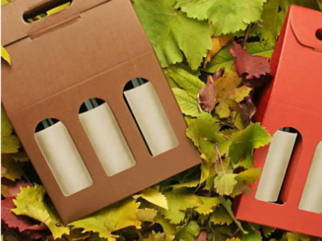
A critical engineering failure point often ignored by graphic designers is Label Scuffing. When shipping via courier networks, the package undergoes thousands of micro-vibrations. If a bottle is secured with abrasive raw corrugated inserts rather than a smooth, precision-fit molded pulp or soft EVA, the friction will completely erase expensive foil stamping and UV coatings by the time it reaches the customer, ruining the premium experience.
Outer Shipper Boxes and Weight Optimization
The mathematics of the outer shipper box dictates your global logistics budget. Professionals evaluate corrugated boards using the Edge Crush Test (ECT) rather than the outdated Mullen Burst test, as ECT directly correlates to how high pallets can be stacked in a shipping container without collapsing. Furthermore, over-engineering the internal cushioning increases the overall cubic volume of the outer box. In modern ocean freight and air cargo, dimensional weight pricing means that an extra inch of unnecessary packaging girth can instantly inflate your per-bottle shipping cost by an alarming 20%.
Navigating Label Compliance and Legal Constraints
Before committing thousands of dollars to printing plates and dies, the design must survive the unforgiving gauntlet of international alcohol legislation. Designing wine packaging is an exercise in creating beauty within a rigid, legally mandated cage.
Essential TBB Requirements and Mandatory Information Layout
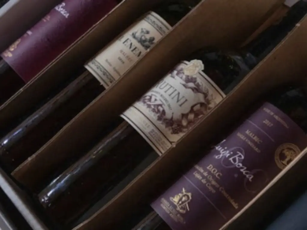
⚠️ Warning: Non-compliance guarantees catastrophe. In the United States, the Alcohol and Tobacco Tax and Trade Bureau (TBB) enforces regulations with zero tolerance. There are documented industry nightmares where hundreds of thousands of meticulously printed ultra-premium labels were seized and incinerated at customs simply because the font size of the “Government Warning” fell 1 millimeter short of the mandatory minimum pica size, or because the color contrast between the text and the background did not meet legal thresholds. Mandatory elements such as alcohol by volume (ABV), exact appellation of origin, and sulfite declarations are non-negotiable dead zones on your design canvas.
Designing Around the Rules: Spacing and Typography Strategies
How do elite designers maintain a sense of luxury while being suffocated by government text? The secret lies in strict grid systems and the strategic legal separation of the “Brand Label” from “Other Labels.” By legally designating the front presentation purely as a brand identifier, designers can preserve immense negative space and high-end minimalism. They then compress the ugly, mandatory compliance paragraphs onto the back label, utilizing sophisticated font weight adjustments (e.g., using a highly legible but ultra-light sans-serif) to ensure the text remains legally compliant without looking like a harsh, industrial warning label.
The True Cost of Design: Budgets, Finishes, and Manufacturing Yields
A design is only as good as its ability to be manufactured profitably at scale. The disconnect between a stunning digital render on an agency’s screen and the brutal, high-speed reality of a bottling line is where profit margins are slaughtered.
Printing Processes and the Cost Multipliers of Special Finishes
Special finishes do not add cost linearly; they multiply it exponentially. Furthermore, physical testing is mandatory. The industry-standard Ice Bucket Test is the ultimate destroyer of cheap materials. If a beautifully designed, uncoated paper label is submerged in ice water for 20 minutes and lacks the proper wet-strength additives and waterproof barrier adhesives, it will aggressively blister, delaminate, and slide off the bottle—turning a luxury product into a logistical disaster.
The Hidden Cost Multiplier Effect
Assume a standard high-quality CMYK printed label costs a baseline of $0.15 per unit.
Adding a single pass of hot foil stamping for the logo immediately increases setup time, plate costs, and waste, pushing the unit cost to ~$0.25.
If the design further mandates deep embossing and a custom irregular die-cut shape, the machine must run significantly slower to maintain registration. The compounded scrap rate and reduced line speed push the final label cost to:
>$0.65 per unit*This represents a 330% increase in packaging expenditure before the label even touches the glass.
Tooling, Die-Cutting, and Managing High Scrap Rates in Production
Aggressive, avant-garde die-cuts with sharp internal angles look spectacular on Pinterest, but they are a nightmare on automated labeling lines. We must analyze the production failure timeline:
Irregular shapes create uneven tension on the release liner (the backing paper). Narrow bridges in the design weaken the structural integrity of the label web.
As the labeling machine pulls the roll at 150 bottles per minute, the uneven tension causes the liner to snap (a “web break”).
The entire production line halts. Engineers must manually re-thread the machine. Yields plummet, and labor costs skyrocket, turning a profitable run into a massive financial loss.
The Integrated Manufacturing Solution: Balancing Craft with Yield
As procurement directors navigate the treacherous waters of multi-vendor supply chains, the fundamental truth emerges: catastrophic scrap rates and misaligned finishing often stem from immense glass tolerances clashing with external printing constraints. This is where Nuvole Glass fundamentally redefines the manufacturing paradigm. By consolidating the entire supply chain, Nuvole Glass delivers an integrated solution that eliminates the friction of multi-vendor sourcing. Their mastery begins with high-purity silica sand temperature control, ensuring an unparalleled optical clarity that serves as the perfect canvas for any premium label. Coupled with their proprietary 3D internal mold engineering, they achieve exceptional structural integrity and lightweight precision without sacrificing the luxurious weight distribution expected in high-end bottles. Furthermore, their in-house, fully automated deep-processing lines guarantee that even the most complex bespoke finishings—from intricate foil stamping to aggressive die-cuts—adhere flawlessly. This seamless synergy between flawless structural engineering and precise aesthetic execution ensures that high-end designs transition from sketch to scale with near-perfect yields, ultimately protecting your profit margins while elevating your brand’s physical presence.
The Paradigm Shift Towards Sustainable Packaging
Sustainability in wine packaging is no longer merely a marketing buzzword or a token gesture of corporate social responsibility; it has mutated into a strict, inescapable financial necessity driven by international taxation and legislative frameworks.
Carbon Taxes and the Hidden Logistics Costs of Over-Packaging
With the aggressive rollout of Extended Producer Responsibility (EPR) laws across European and North American markets, wineries are now financially penalized based on the weight and non-recyclability of their packaging. Calculating the true cost reveals a stark reality: cutting 150 grams of unnecessary, heavy glass from a bottle design, and eliminating toxic heavy-metal foils that render paper unrecyclable, can save an exporter tens of thousands of dollars in punitive carbon taxes and ocean freight fuel surcharges annually. Eco-design is fundamentally profit protection.
Alternative Formats and Eco-Friendly Materials: Molded Pulp to Paper Bottles
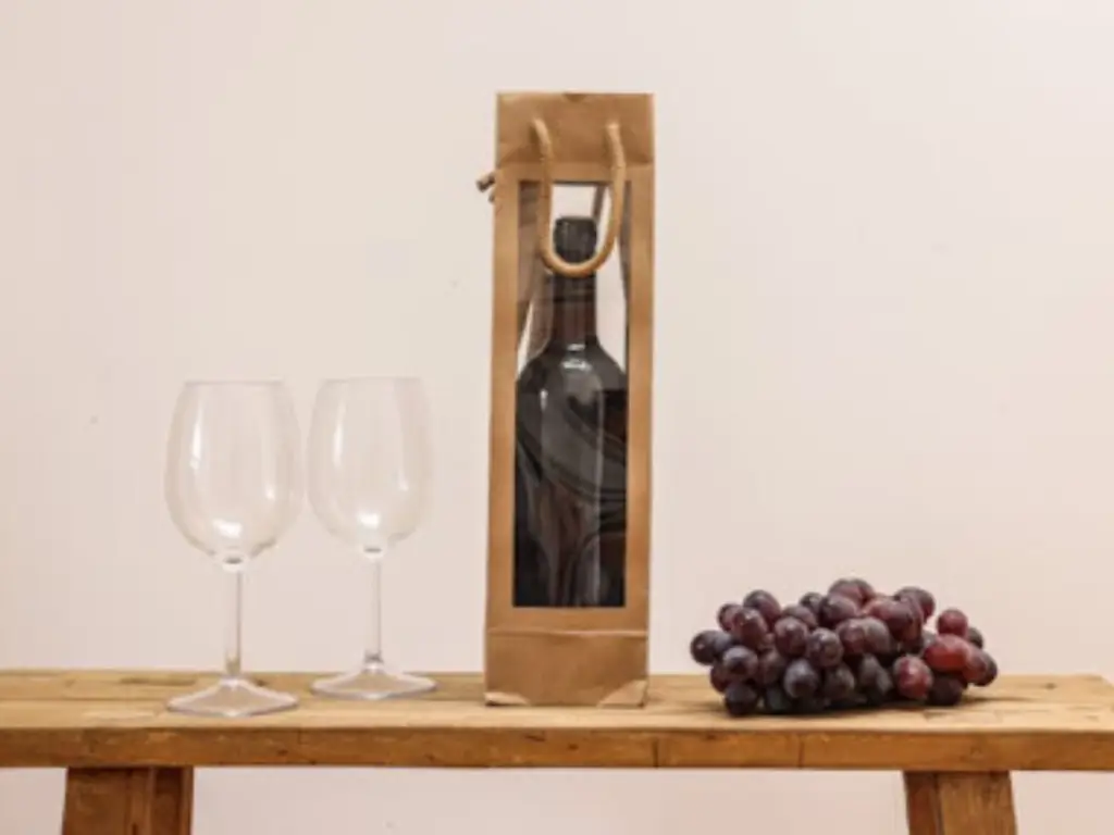
While the market is flooded with trendy “paper bottles” and bag-in-box solutions, procurement experts must evaluate these innovations using cold, hard metrics—specifically the Oxygen Transmission Rate (OTR). Many eco-friendly paper bottles rely on thin internal EVOH bladders to hold the liquid. While excellent for fast-moving consumer goods meant to be consumed within six to twelve months, their current OTR barriers are incapable of protecting a fine wine destined for years of cellaring. Conversely, utilizing custom molded pulp for secondary outer packaging provides a brilliant equilibrium: it utilizes 100% biodegradable post-consumer waste, offers exceptional shock absorption, and delivers a highly bespoke, organic luxury aesthetic without compromising the integrity of the primary glass vessel.
Conclusion: Finding the Equilibrium
World-class wine packaging design in 2026 is an intricate balancing act. It demands a flawless synthesis of psychological brand storytelling, rigorous physical protection, unyielding legal compliance, and sharp cost-engineering. True ROI is unlocked not when an artist draws a beautiful label, but when brand owners integrate manufacturability, sustainability, and precise structural engineering from the very first sketch.
Transform Your Packaging Vision into Reality
Stop compromising between breathtaking design, production yields, and structural safety. Partner with the industry leader in integrated, high-end glass manufacturing and finishing.
Consult Our Experts