A frosted glass bottle wins saves by the thousand on social media, then never survives a phone call with a filling plant. That gap is not a matter of taste. Every pretty container has to pass through four layers of decisions, and most cosmetic packaging ideas never make it past the first one.
Those layers arrive in a fixed order in real projects: style first, structure second, identity third, the purchase order last. A skipped layer does not disappear. Later it reappears as a leaking pump, a misread label, or a mold that has to be cut twice.
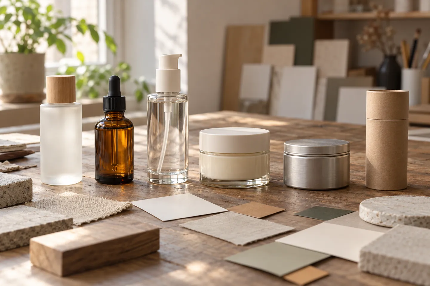
What Your Packaging Style Is Actually Saying
A style is not decoration. It is a promise about what is inside, and shoppers read it in about three seconds at shelf distance or half a second in a feed. Six languages cover most of what you will see in beauty aisles this year.
Six Packaging Style Languages and What They Signal
| Style | Shelf signal | Fits best | Watch out for |
|---|---|---|---|
| Minimalist | restraint, clarity, clinical confidence | skincare, derm-adjacent lines | category words shrink until bottles get misread |
| Quiet luxury | weight, deep materials, heritage | fragrance, prestige skincare | glass weight and deep finishes raise unit cost; faint designs vanish in thumbnails |
| Natural / organic | kraft tones, botanicals, softness | clean beauty, spa lines | reads as greenwash without material consistency behind it |
| High-saturation / playful | energy, youth, gifting | Gen Z makeup, bath | dates quickly and clashes with clinical claims |
| Clinical / derm | precision, actives, lab authority | serums, treatments | feels cold for indulgent categories; expects dropper or airless grammar |
| Apothecary / vintage | ritual, recipes, nostalgia | balms, bars, men’s care | skews craft and can undercut science-led claims |
Minimalism deserves the first warning. In one public design critique, commenters mistook a minimal face-cream line for hair color because the words “Facial Cream” were nearly invisible at scanning distance (r/graphic_design thread, 2024). Minimalism that deletes category words does not read as premium; it reads as confusion. Photograph your mockup from two meters, squint, and ask what a stranger would call it.
Pick the language your category already speaks, then differentiate inside it. A derm serum dressed in apothecary styling forces shoppers to relearn what you sell, and that relearning is charged against your marketing budget.
Eight Cosmetic Packaging Ideas You Can Actually Brief
These concepts start with recognizable stock formats, then use color, proportion, decoration, and product grouping to create a distinct line. Treat each as a starting brief: formula, closure, label, and shipping pack still have to work together.
1. Make the Product Category the Graphic Hero
Build a family of clear or softly frosted bottles with the product name set large across the front: CLEANSER, TONER, SERUM. Keep the brand mark smaller and use one colored band to distinguish formulas within each category. Shoppers can identify each bottle before reading fine print. Test the largest and smallest SKU side by side, in a hand-held photo and at thumbnail size. If the name disappears on the travel bottle, simplify the hierarchy instead of shrinking every element equally.
2. Turn a Stock Bottle Into Quiet Luxury
Choose a stock glass shape with a clean shoulder and substantial-looking base, then give it one memorable detail: a satin cap, narrow metallic rule, or restrained screen printing. Repeat that detail across the range while changing only the formula name and accent color. This suits prestige skincare or fragrance without requiring a custom mold. Examine physical samples in daylight and warm bathroom light; a finish that looks rich in a render can look patchy on glass. Check that the cap’s finish matches its collar and pump.
3. Create a Numbered Treatment System
For serums with different routines, put a large 01, 02, or 03 on each pack and pair the number with a plain-language product name. A color key can reinforce the sequence without becoming the only way to tell products apart. Use the same silhouette, but select the dispenser for each formula rather than forcing every treatment into a dropper. On the carton or back label, explain when to use each step. The order must reflect the actual routine; do not invent a sequence just to make the shelf look orderly.
4. Design the Refill as Part of the System
Give a hero bottle the more durable visual treatment, then design a simpler refill pack with matching typography. Show where the bottle opens, how the customer pours or swaps contents, and which parts are kept. A refill claim should follow a working refill experience, not merely a second pouch in the catalog. Prototype the neck and closure with the real product, check for mess during transfer, and write clear cleaning or reuse instructions where appropriate. Price the refill so its value is obvious to the customer.
5. Let Small Formats Become a Discovery Set
Instead of shrinking a full-size label until it becomes unreadable, make mini bottles with abbreviated front labels and full details on a shared sleeve. A consistent cap, color code, and outline make the set feel curated. This works for scent discovery, skincare trials, and gifting. Before choosing the box, place filled samples in the insert and shake-test the closed pack: glass touching glass can spoil the unboxing. Photograph the set open and closed; one view sells the choice and the other shows how it arrives.
6. Build a Bathroom-Ready Body-Care Pair
Pair a wash and lotion with the same bottle footprint but different dispensing heads and prominent product names. Use high-contrast printing legible against the filled product, and keep illustration clear of practical information. A ribbed collar or broad base can give the pair a tactile cue without adding another component. Test labels and decorative finishes after repeated wet handling, then check whether the pump operates comfortably with one hand. The bottles should look related yet remain easy to distinguish in a hurried shower.
7. Give Natural Cues a Material Logic
For a spa or botanical line, combine muted glass, one botanical illustration, and a simple paper carton instead of stacking leaves, kraft texture, twine, and green slogans. Let the ingredient or scent name carry the story. Distinguish decorative elements from environmental claims that can actually be supported. A removable paper sleeve may add a tactile surface without permanently covering the bottle; test its fit through packing and transit. Photograph the pack next to the unboxed bottle so the identity survives after the carton is discarded.
8. Make a Gift Kit That Can Be Reordered
Build a routine kit from individually sellable bottles and jars. Use a modular insert to hold different combinations and print the routine on the inside lid, where it helps after opening without crowding the exterior. Keep the outer graphics broad enough for more than one season; change a sleeve or card for a limited edition. Test the heaviest combination and verify that the insert protects every component in transit. Each product should remain recognizable when the customer buys it again on its own.
Choose two or three directions that fit your formula and price point. Make a board for each: front and side views, cap, dispensing action, filled-product color, and the pack at shelf and phone-screen size.
Let the Formula Choose the Container
Remember this
The formula chooses the container. The mood board votes second.
Four properties narrow the field before aesthetics get a vote: viscosity, oil content, alcohol level, and light sensitivity. Everything in this section follows from those four.
Viscosity
picks the dispenser
Oil content
tests the pump seals
Alcohol level
challenges coatings and seals
Light sensitivity
chooses the glass color
The Formula Picks First
Viscosity decides the dispensing grammar. Thin, water-like fluids suit fine-mist sprayers and toner bottles. Serums and oils need droppers, treatment pumps, or roll-ons that meter small doses. Thick creams rule out pumps entirely and point to jars or squeezable tubes.
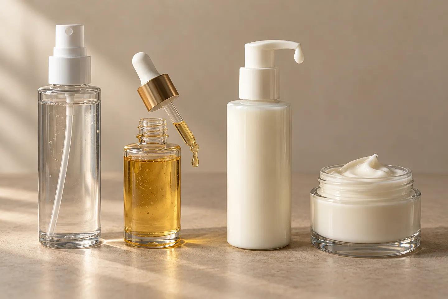
Oil-based formulas are the classic edge case. Water-based perfumes run through standard pumps straight away. Oil-based ones need pump-compatibility testing with the real formula, because elastomer seals and spring materials react to oils over time. Alcohol content is the second variable: high-alcohol formulas can attack certain coatings and seal compounds. Light sensitivity is the fourth: vitamin C and retinoids argue for colored or opaque glass, or for a carton that does the blocking.
Glass, Plastic, or Aluminum: The Honest Trade-Offs
Glass is chemically inert, carries real weight on the shelf, and recycles at mature rates; recycled content in fragrance glass commonly reaches 70% (manufacturer material notes). Those costs are shipping weight and breakage risk. Clear glass also shows the product while transmitting the light that sensitive formulas resent.
Plastic wins on weight, cost, and travel formats. Post-consumer recycled content is widely available, though high PCR shares shift color and clarity. Barrier performance against oxygen and fragrance loss is weaker than glass, which matters for actives and perfume.
Aluminum blocks light completely, weighs little, and rides a mature recycling stream. You give up product visibility, and decoration centers on printing rather than the deep treatment plays of glass.
Tubes, pouches, and compacts have their own logic, but the rule is identical: match the barrier and the dispenser to the formula, then style the result.
Dispensing Is the Product Experience
The dispenser is the part your customer touches every day, so it is where the idea becomes an experience. Droppers dose serums precisely. Lotion pumps control daily portions. Fine-mist sprayers serve fragrance and setting mists. Airless systems protect preservative-light formulas from air, and roll-ons own the eye-treatment niche.
Spray output is a specification, not a detail. Published figures for standard perfume pumps run around 0.6 to 0.8 ml per press, while precision pumps reach 1.0 to 1.3 ml with a finer mist (manufacturer-published spray data). That difference sits in your customer’s hand every morning.
Below is the matrix of recurring failure pairs. Read the right-hand column as money.
Creative Directions and Where They Fail
| Idea | Works when | Fails when |
|---|---|---|
| Clear glass + citrus oils | shelf storytelling matters | formula is light-sensitive; citrus oils degrade, so use colored glass or a blocking carton |
| Fine-mist pump + oil-based serum | the marketing story wants “mist” | oils gum the pump; demand compatibility testing before committing |
| Airless bottle + low-preservative formula | claim integrity matters | viscosity is too high to feed the pump |
| Soft tube + high-potency actives | travel sizes and portability | certain plastics adsorb actives and shelf-life potency drops |
| Paper-based outer pack + bathroom storage | sustainability story | humidity softens the pack; add a coating or accept visible wear |
Every row on the right is a failure that has happened to somebody, and none of it shows up in a rendering.
Container pass does not mean package pass. A bottle can test perfectly while the gasket, spring, or pump core inside it fails with your formula. Multi-component packaging gets tested as a system, with the real formula, before mass production.
Decoration and Customization: Where Identity Gets Made
Once structure is settled, the question becomes identity. Your name, color, and texture have to land on the surface somehow, and you have to decide how far to go from a factory-standard bottle toward something nobody else has.
Decoration Techniques at a Glance
| Technique | Effect | Pairs with | Watch out for |
|---|---|---|---|
| Silk-screen printing | sharp, durable logo color | minimalist and clinical styles | each added color adds cost |
| Hot stamping | metallic shine | quiet luxury | rubs off on high-touch areas |
| Electroplating | mirror-metallic body | prestige fragrance | complicates recyclability |
| Soft-touch coating | velvet matte hand feel | modern skincare | abrades with alcohol-heavy formulas |
| Frosting | translucent glow | natural and spa lines | shows fingerprints on shelf |
| Embossing / debossing | tactile 3D logo | apothecary and luxury | needs wall thickness headroom |
Decoration is the affordable end of customization. Customization gets expensive at the mold, and the ladder between decoration and a private mold has four rungs.
Stock: buy an existing bottle as-is. Fastest and cheapest; identity comes from decoration and the outer pack.
Modified stock: change cap, pump, or color on an existing mold. Small tweaks, small tooling impact.
Semi-custom: stock mold plus a dedicated decoration program and custom carton. The workhorse of first orders.
Full custom: a private mold with an exclusive silhouette. Tooling fee, longer timeline, and the design must be frozen first.
Two things have changed in this layer. Refill systems keep the outer pack for years and resell only the inner product, so packaging stops being a cost line and becomes a retained asset. Sustainability now carries a measurable price signal too: respondents to a 2024 global survey said they would pay 9.7% more on average for sustainably produced or sourced goods, although that is a broad consumer signal rather than a guaranteed cosmetics price premium (PwC, 2024). Decoration can quietly veto the claim, though: electroplated and multi-layer finishes make recycling harder. An eco story on a chrome-plated bottle invites the exact skepticism it was meant to avoid.

One rule has saved brands real money here: no decoration is approved from a screen. One Pantone reads differently on clear glass, frosted glass, and coated aluminum. A logo that lies flat in a file also wraps strangely around a curve. Approve a decorated physical sample under store lighting before mass production.
Silk-screen, hot stamping, frosting, or embossing: send your Pantone numbers and target bottle, and Nuvole’s design team returns concept renders within 48 hours.
Request 48-Hour Concept RendersFrom Idea to Order: The Execution Chain
Packaging ideas can fail in procurement when specifications are too thin to quote against, tests are skipped, or minimum order quantities surface late. Roughly eight links make up the execution chain. Treat each one as a checkpoint with a written owner and an answer before committing to production.
Write One Spec Sheet per SKU
“Fifty thousand pieces of 100 ml lotion bottle” is not a specification. It is a lottery ticket. Quotes built on it are not comparable, and the cheapest one wins for reasons that have nothing to do with your project.
A comparable quote needs: material, neck finish, closure or pump type, dose, color, surface finish, decoration method and color count, packing method, quantity per SKU, and destination country. One page per SKU. Quotes become comparable and misunderstandings become rare.
Sample and Test With the Real Formula
A beautiful empty sample proves nothing. Fill it with your formula and check leakage, pump performance, formula compatibility, drop resistance, vacuum behavior, weight loss over time, surface durability, and a transport simulation. Multi-component packs deserve extra suspicion, because a bottle can pass every test while the gasket inside it fails.

MOQ, Lead Time, and the Backward Timeline
MOQ is not one number. Bottle, pump, cap, custom color, and decoration each can carry its own minimum, and the program total is what decides whether your launch math works.
Timelines run backward from the day your filler needs goods. A typical published sequence at an established custom-glass manufacturer looks like this:
Day 0: brief with formula profile and quantity
48 hours: 3D concept renders
3-7 days: 3-5 design concepts
~day 7: sample confirmation
days 8-42: production (30-35 days typical)
delivery: global delivery within about 45 days
One manufacturer’s published beats; fully custom molds add tooling time before production.
Lock the launch date first and force the chain to fit, and you have inverted the risk. Your calendar absorbs every delay, and the first thing a squeezed schedule sacrifices is testing.
What matters is total cost, not unit price:
Total packaging cost checklist:
- unit price at your real quantity
- tooling
- decoration setup
- multi-part assembly
- testing samples
- cartons trays and dividers
- defect allowance (AQL)
- freight by volume
- reorder MOQ and lead time
Suppliers differ by three cents a unit and then cost you a month in reorders. Price the checklist across a year and the real comparison appears.
What This Means for Your First Order
Three facts from the layers above decide a first order. Identity comes mostly from decoration and structure choices, not from an exclusive silhouette. A mold is a liability until the design is frozen, because changes to capacity, neck, or wall restart tooling. And tooling plus production can consume two to three months that marketing plans rarely reserve.
So buy identity, not molds, on the first round. Stock or semi-custom molds with a deliberate decoration program deliver most of the shelf distinctiveness at a fraction of the commitment. And they keep your budget on the side of the business that can still change its mind.
Full custom is not wrong; it is sequenced. When a SKU has proven volume, or the product genuinely needs a structure no stock mold offers, a private mold becomes the correct next investment instead of a gamble.
Between a saved image and a shelf product sit four decisions. Pick the style your category speaks, the structure your formula tolerates, and the identity your budget sustains, then leave your order chain room for tests. Get those four right and the pretty bottle takes care of itself.
At Nuvole Glass, the stock-first route is not a compromise we upsell past. Our catalog holds more than 500 stock bottle designs and 500 cap designs across perfume and skincare formats. On top of them we build the identity layer: silk-screen, hot stamping, soft-touch, frosting, embossing, plus matching cartons and inserts as one program. If you want to compare stock bottle molds and decoration options against your first-order numbers, our design team returns concept renders within 48 hours. And we will say so plainly when a project has outgrown stock.
Buy Identity, Not Molds, on Your First Order
Compare 500+ stock bottle and cap designs with a full decoration program: renders back within 48 hours, and plain advice when a project outgrows stock.
References
- PwC. “2024 Voice of the Consumer Survey.” 2024. https://www.pwc.com/gx/en/news-room/press-releases/2024/pwc-2024-voice-of-consumer-survey.html
- r/graphic_design community. “How can I improve this cosmetics brand packaging design?” 2024. https://www.reddit.com/r/graphic_design/comments/1fzocif/how_can_i_improve_this_cosmetics_brand_packaging/